Project
Objective
A wordmark logo and a responsive e-commerce website for a clothing store.
Target users
Online shoppers seeking quality and affordable clothing.
Tools
Pen and paper, Sketch, InVision
Design process

Empathy
Market research
Competitive analysis
User interviews
Contextual enquiries

Define
Personas
Empathy maps
Problem statements

Ideate
Ideation
Sitemap
User flows
Wireframes

Prototype
Lo-fi prototypes
Hi-fi prototypes

Test
Usability testing
Affinity maps
Empathy
Market research and competitive analysis
We started this phase with market research and knowing our competitors. Market research helped us to gain an understanding on the current trends and where the retail industry is heading to. We looked at competitors websites to find their strengths & weakness and also to find out potential opportunities in the gaps in their offerings.
Next, we wanted shoppers to share their buying experience when they shop online, the services they enjoy or the wishes they want fulfilled from their favourite brand. We also wanted to learn the pain points, their thoughts about the pricing & quality and any improvement ideas they have.
User Interviews
We interviewed participants to find out why and how they shopped online. We then observed them shop on their favourite online retail website & making a purchase of a product.
Some key output of the research —
1. Users want better size information for clothing.
2. They want high definition images.
3. They prefer navigation rather than search.
4. They want transparency and dislikes hidden charges at checkout.
Define
As we moved to the define phase it was time to synthesise the information gathered so far about our users, and to start to organize it so that we can make sense of it. We started to look for meaning and patterns in the data.
From our research, we derived a persona which focuses on Sam. Sam is a business analyst who likes shopping online because of his busy schedule. He is a serious buyer and given his busy schedule, he wants to focus on browsing products and wants to spend less time in the purchase flow.
Persona
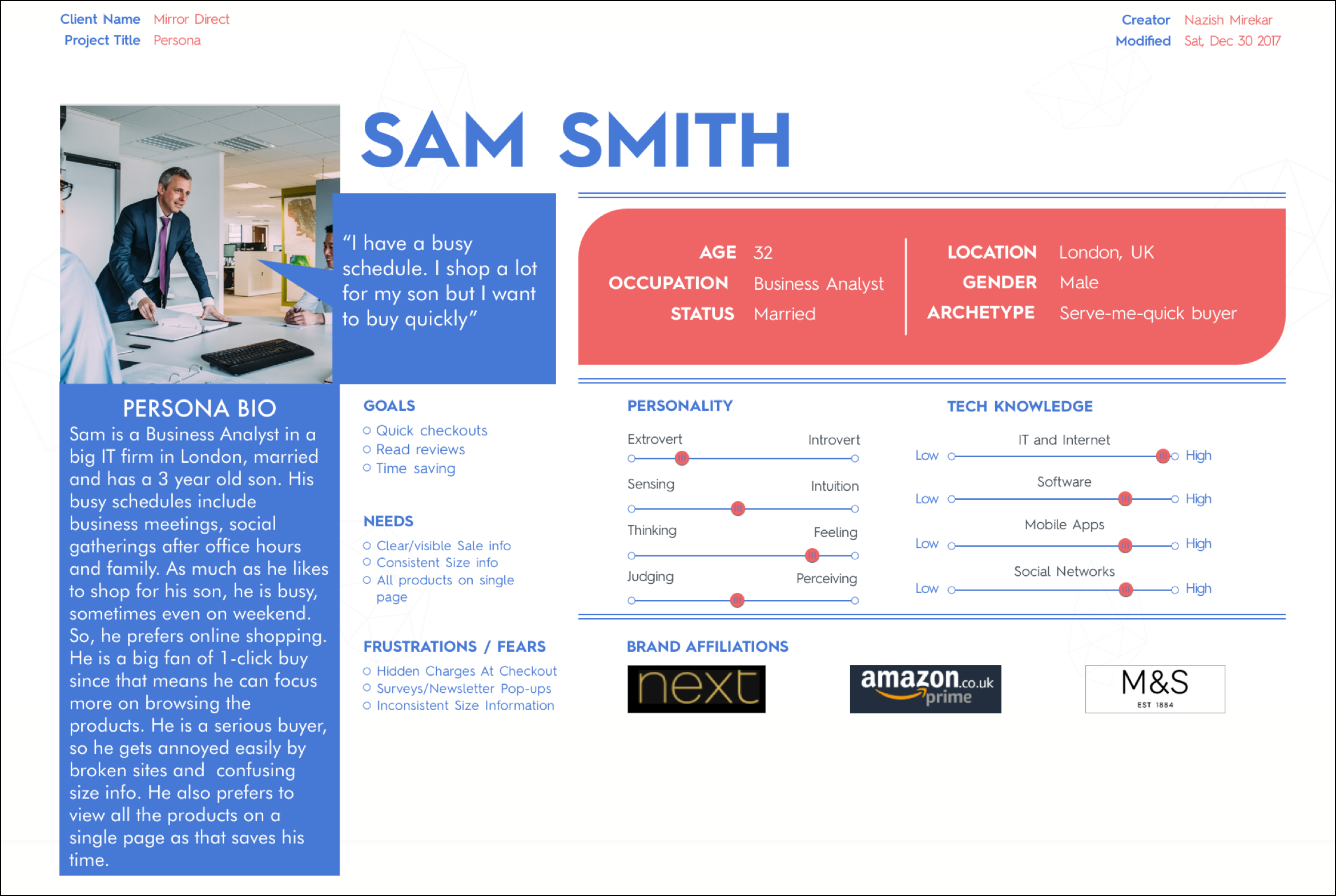
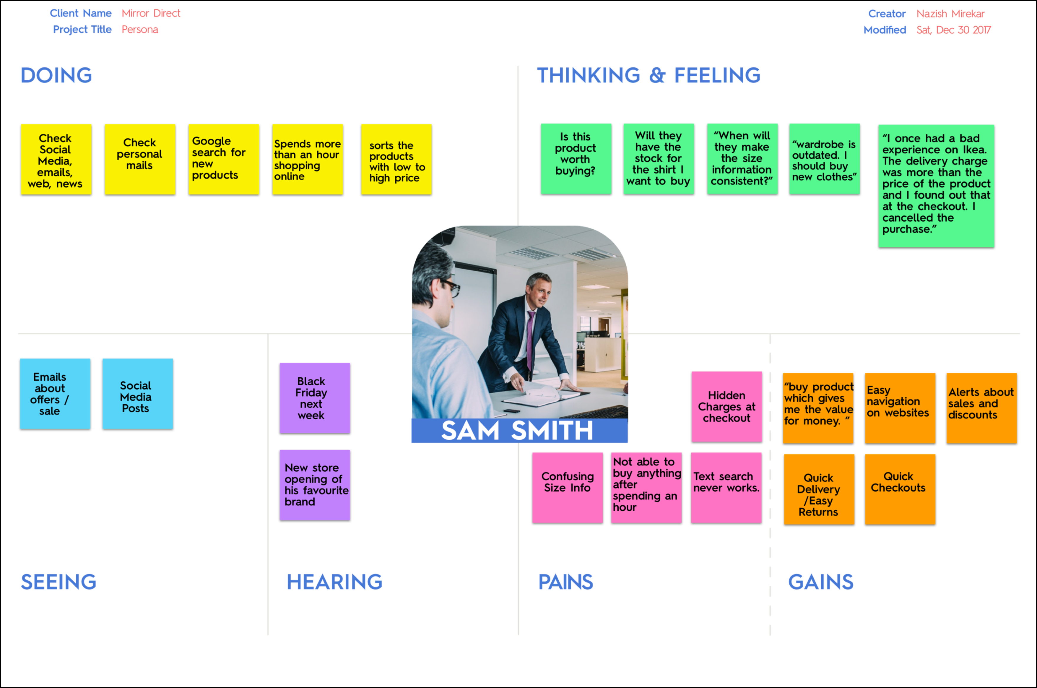
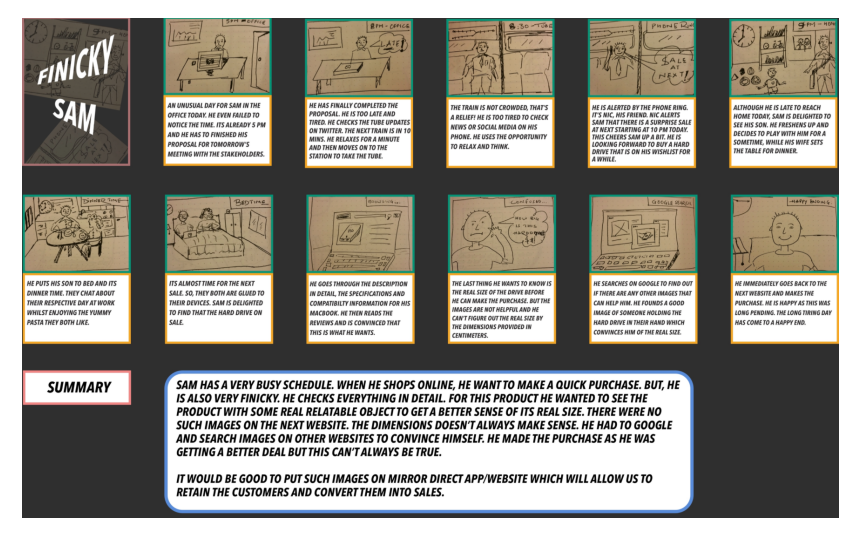
After the persona development, we created an empathy map and a story board to understand Sam's motivations and experiences. We found out him to be very attention-to-detail archetype in that he checks everything closely before making a purchase.
Empathy map
Storyboard
Ideate
We kicked off the IDEATE phase with a card sorting exercise to determine how users understand and categorise information. We went for the open card sorting as it helps us understand how users organised and labelled the content in a way that made sense to them. We shared list of clothing items with the participant with a simple goal of sorting them into categories of their own.
After the content was organised into categories, we create the sitemap to show the relationship between the content.
Using our sitemap and the persona we mapped out a simple user flow of the buying process. The flow shows how a user would use the navigation to select a category, apply filters and make a purchase.
We then started to sketch layouts to generate a number of ideas. The goal was to see if users can figure out how to use the site to find an item and put them in the basket. We then moved to create lo-fi wireframes using the strongest of ideas. The wireframes helped in establishing visual hierarchy and creating a final layout of the elements. Then we made lo-fi responsive wireframes for desktop, tablet and mobile.
Prototype and test
Mirror wanted a new logo as the current want is outdated but they want the name to be part of the logo in order for their customers to identify the store. So, we designed a simple word mark logo with a monogram that can be used as a favicon or on mobile screens.
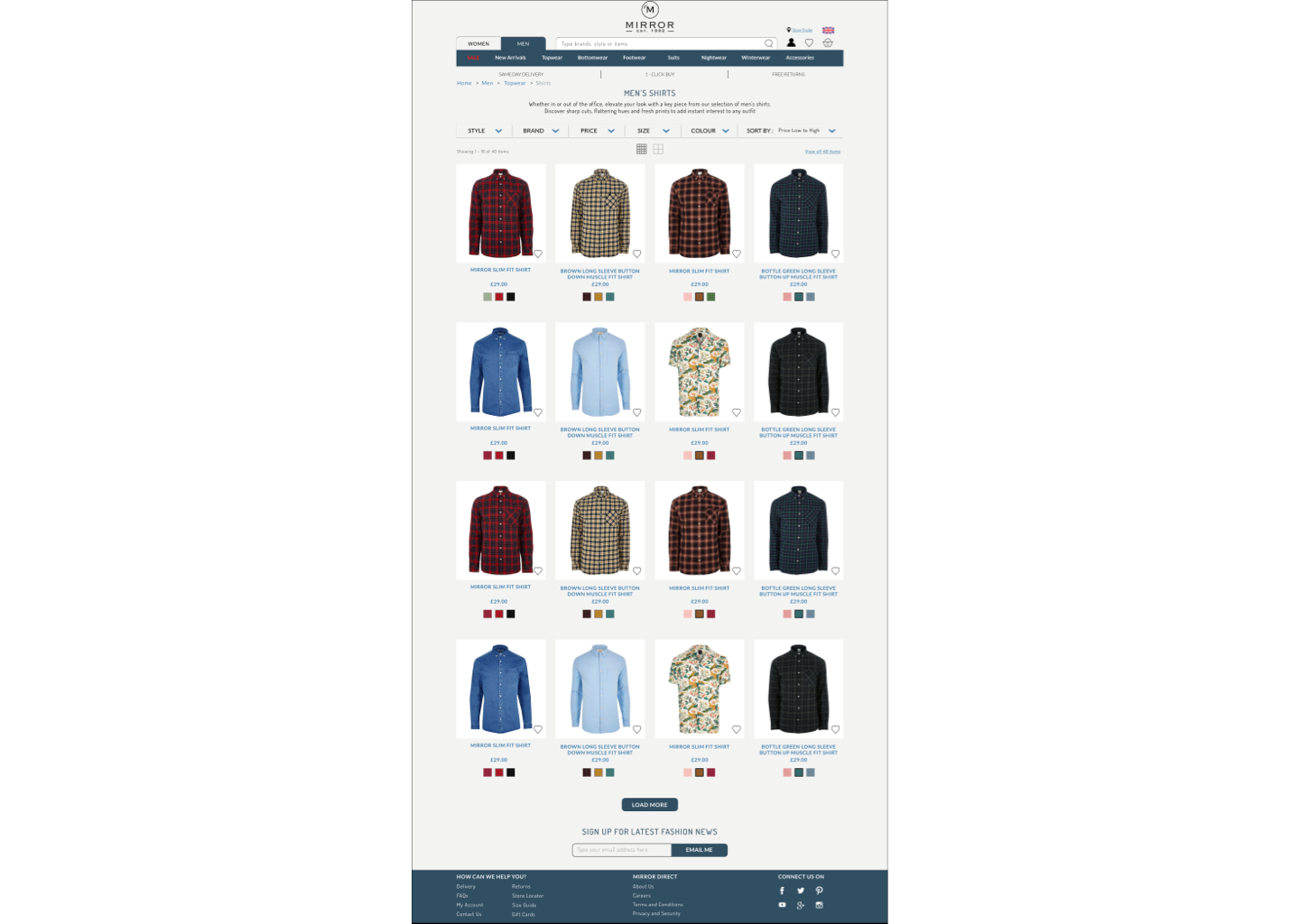
We then moved to put together a simple colour palette, typography, statuses, buttons and high definition coloured images to create a UI Kit. We used this UI kit to design Hi-Fi wireframes and design key interactions.
After creating high-fidelity screens for the user flow, We put them into an interactive prototype using Invision. The goal was to create a working model of the website for the user to interact with. We then arranged a usability test to check how easy it was to use our website. Using the observations from the usability tests we created an affinity map which highlighted the pains and gains of the user along with certain suggestions that all users had in common.
We focussed on the pain points, prioritised them and created the final designs on the Mirror website.
Hi Fi Wireframes
Reflection
This project has been a great learning experience overall. I really enjoyed interacting with users in during the research, card sorting and usability testing. It has really helped me understand how users think and behave when they interact with a product or a service. Looking back, I think I would engaged with more users which would have helped me in creating more personas.
Observing participants do the card sorting exercise was quite useful. It really paved the way for information architecture where I learned how to organize the raw data I had collected so far. Sketching wireframes, digitizing them, adding colours and interaction was both fun and exciting. I think I would have used a better colour palette and would have added more interactions. The real satisfaction was the positive feedback from usability testing of the Hi-Fi prototype.
Working closely with users has helped me design better; it is what I want to stick to in future designs.


